It is pretty common nowadays, where we want to indicate to the user that there is more content off screen, or outside the “viewport” the content is in. Showing a scrollbar can be a solution, but it might not be visually pleasing to show a scrollbar, so the other way is to use a fade out effect near the end of the viewport, to “afford” that there is more content.
And to achieve the fade out effect, we will leverage the idea of masking.
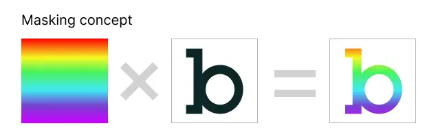
Masking concept
To understand the basic idea of masking, it is the combination of 2 images, with one being the one that defines what part of the underlying image will be seen through. As it is hard to explain in words, here is a visual explanation of masking.
Scrolling container mask
With the basic understanding of masking, we can make use of CSS’s mask-image property to achieve the effect. Here is the different state the mask container might be in when there is an overflow at the top or bottom.
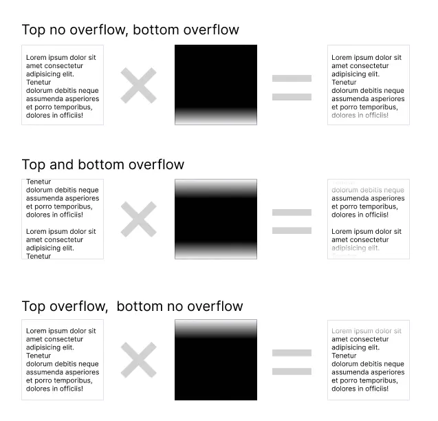
So the mask-image property will be set to a linear-gradient() value, where the top and bottom gradient stop is dynamic according to whether the top and bottom content has overflown. And in order to do that, we will calculate it in JavaScript.
OverflowFadeOutScroller component
Here is the code for the OverflowFadeOutScroller.vue component.
<script lang="ts" setup>
import { useResizeObserver } from "@vueuse/core";
import { computed, onMounted, onUnmounted, ref } from "vue";

const props = withDefaults(
  defineProps<{
    scrollBarWidth: string;
    fadeMaskHeight: string;
  }>(),
  {
    scrollBarWidth: "8px",
    fadeMaskHeight: "32px",
  }
);

const el = ref<HTMLElement>();
const hasTopOverflow = ref<boolean>(false);
const hasBottomOverflow = ref<boolean>(false);
let resizeObserverControls: {
  stop: () => void;
};

function onScroll() {
  if (el.value) {
    const scrollTop = el.value.scrollTop;
    const scrollBottom =
      el.value.scrollHeight - el.value.scrollTop - el.value.clientHeight;
    hasTopOverflow.value = scrollTop > 0;
    hasBottomOverflow.value = scrollBottom > 0;
  }
}

onMounted(() => {
  if (el.value) {
    el.value.addEventListener("scroll", onScroll);
    resizeObserverControls = useResizeObserver(el.value, onScroll);
  }
});

onUnmounted(() => {
  if (el.value) {
    el.value.removeEventListener("scroll", onScroll);
    resizeObserverControls.stop();
  }
});

const style = computed<Record<string, string>>(() => {
  return {
    "--top-gradient-stop": hasTopOverflow.value ? "transparent" : "black",
    "--bottom-gradient-stop": hasBottomOverflow.value ? "transparent" : "black",
    "--scrollbar-width": props.scrollBarWidth,
    "--mask-height": props.fadeMaskHeight,
  };
});
</script>
<template>
  <div ref="el" class="masked-overflow" :style="style">
    <slot></slot>
  </div>
</template>

<style scoped>
/*article from: https://pqina.nl/blog/fade-out-overflow-using-css-mask-image/*/
.masked-overflow {
  /* If content exceeds height of container, overflow! */
  overflow-y: auto;
  overflow-x: hidden;

  /* Keep some space between content and scrollbar */
  /* padding-right: 20px; */

  /* The content mask is a linear gradient from top to bottom */
  /* top-gradient-stop and bottom-gradient-stop provided by computed style  */
  --mask-image-content: linear-gradient(
    to bottom,
    var(--top-gradient-stop),
    black var(--mask-height),
    black calc(100% - var(--mask-height)),
    var(--bottom-gradient-stop)
  );

  /* Here we scale the content gradient to the width of the container
      minus the scrollbar width. The height is the full container height */
  --mask-size-content: calc(100% - var(--scrollbar-width)) 100%;

  /* The scrollbar mask is a black pixel */
  --mask-image-scrollbar: linear-gradient(black, black);

  /* The width of our black pixel is the width of the scrollbar.
      The height is the full container height */
  --mask-size-scrollbar: var(--scrollbar-width) 100%;

  /* Apply the mask image and mask size variables */
  mask-image: var(--mask-image-content), var(--mask-image-scrollbar);
  mask-size: var(--mask-size-content), var(--mask-size-scrollbar);

  /* Position the content gradient in the top left, and the
      scroll gradient in the top right */
  mask-position:
    0 0,
    100% 0;

  /* We don't repeat our mask images */
  mask-repeat: no-repeat, no-repeat;
}

/* Firefox */
.masked-overflow {
  scrollbar-width: thin; /* can also be normal, or none, to not render scrollbar */
  scrollbar-color: currentColor transparent; /* foreground background */
}

/* Webkit / Blink */
.masked-overflow::-webkit-scrollbar {
  width: var(--scrollbar-width);
}

.masked-overflow::-webkit-scrollbar-thumb {
  background-color: currentColor;
  border-radius: 9999px; /* always round */
}

.masked-overflow::-webkit-scrollbar-track {
  background-color: transparent;
}
</style>
Notice in the code, we also account for the space of the scrollbar to not be affected by the mask.
Demo
Scroll the following text content to see the fade-out effect.
Notice when you scroll to the end of the content, it will not show the fade-out effect to indicate the end of the scroll.
Conclusion
I always like the idea of using visual affordances to drive expected user behavior instead of providing textual guides. Leveraging the use of CSS mask makes some interesting use-case of visual affordance to improve our UI and UX. I am always in the look out of good affordances we can inject into our UI. Do let me know if you see good affordances not in the UI space but also in tangible product designs.