One of those annoying things that happens when developing a web application for multiple browsers, even today in year 2021, is the unexpected inconsistencies. And today I want to share one that I found recently while testing it on mobile browsers. The issue is related to the CSS viewport height unit, also know as vh.
Background problem
The issue that I was facing in my web app while developing is that I wanted to have a mobile-native app-like experience where the web app is fullscreen but somehow the bottom part of the content was cropped when viewed from a mobile browser. After doing some research on the internet, I finally found out the culprit being CSS’s viewport height (vh). The full story and solution of the issue is taken from this post in css-tricks.com. Shout out to Louis Hoebregts for the solution!
Solution
The tl;dr solution is to use the value from window.innerHeight in combination with CSS’s Custom Properties. In addition, subscribing to the window’s resize event and setting the Custom Property as the user resizes the browser will refresh the window.innerHeight value and update the Custom Property accordingly.
As I’m using VueJS, I implemented my solution in a composable. Do note that I also added a debounce function from the awesome VueUse library.
Here is properViewportHeight.ts
import { useDebounceFn } from "@vueuse/core";
import { onMounted, onUnmounted } from "vue";

export function useProperViewportHeight(customPropertyName = "--vh"): void {
  const element = document.body;
  const onViewportResized = useDebounceFn(() => {
    if (element) {
      const vh = window.innerHeight * 0.01;
      element.style.setProperty(customPropertyName, `${vh}px`);
    }
  }, 50);

  onMounted(() => {
    if (element) {
      const vh = window.innerHeight * 0.01;
      element.style.setProperty(customPropertyName, `${vh}px`);
      window.addEventListener("resize", onViewportResized);
    }
  });

  onUnmounted(() => {
    if (element) {
      element.style.removeProperty(customPropertyName);
      window.removeEventListener("resize", onViewportResized);
    }
  });
}
And to use it, I call the composable in the root component: App.vue and setting the .proper-vh CSS classes in the root element.
<script setup lang="ts">
import { useProperViewportHeight } from "@/composables/properViewportHeight";
useProperViewportHeight();
</script>
<template>
<div class="proper-vh min-proper-vh">...</div>
</template>
<style>
.proper-vh {
height: calc(100vh);
height: calc(var(--vh, 1vh) * 100);
}
.min-proper-vh {
min-height: calc(100vh);
min-height: calc(var(--vh, 1vh) * 100);
}
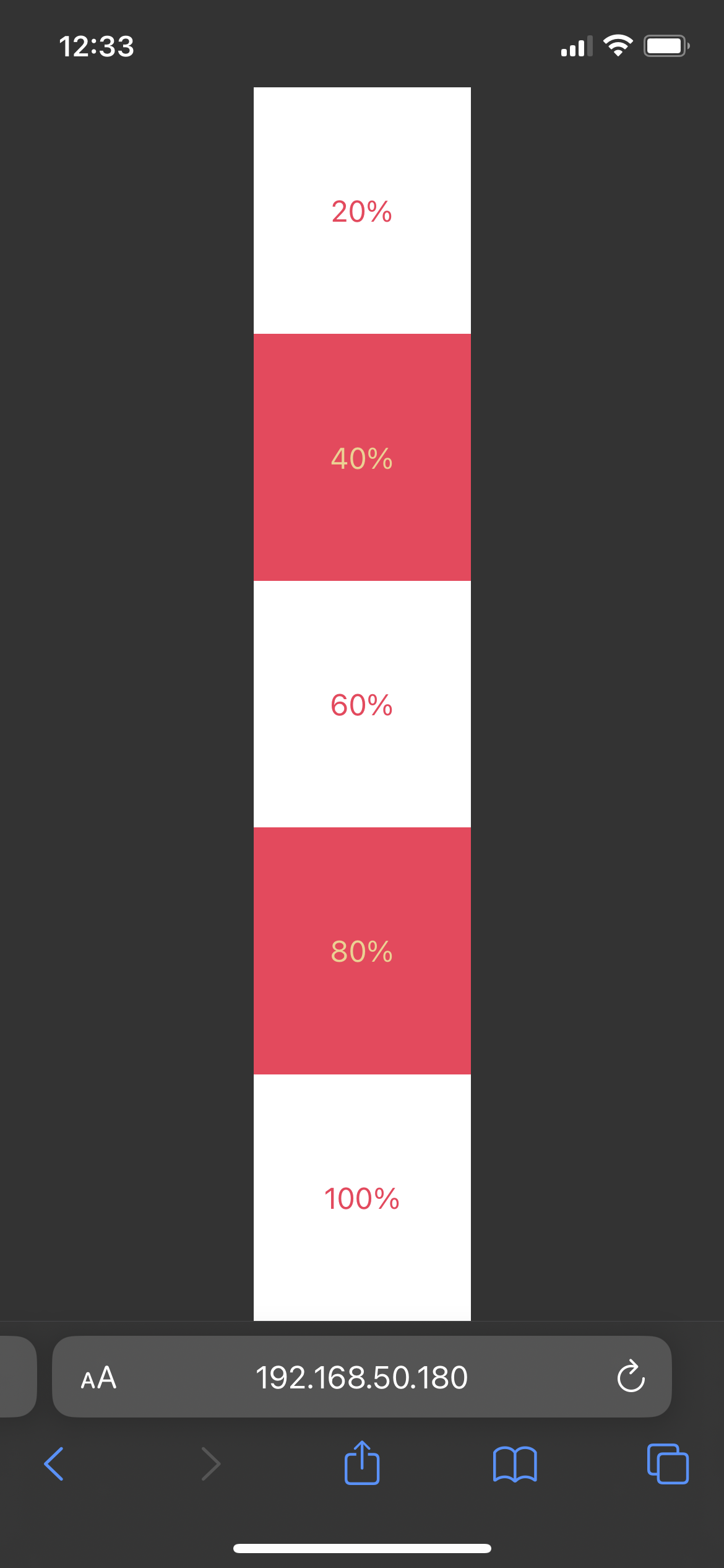
</style>This should be what it looks like when viewed from a mobile browser. The 100% box should not be cropped.