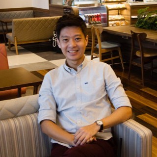
One of the aesthetically pleasing example of using the squircle is for avatars. Here is my LinkedIn profile with the squircle shape. Lets see how we can create this in CSS.
Using CSS mask
Because we can’t emulate the shape using border radius, we will instead use CSS masking. Refer to this MDN documentation for CSS mask.
.mask {
  mask-size: contain;
  mask-repeat: no-repeat;
  mask-position: center;
}

.mask-squircle {
  mask-image: url(data:image/svg+xml;base64,PHN2ZyB3aWR0aD0nMjAwJyBoZWlnaHQ9JzIwMCcgeG1sbnM9J2h0dHA6Ly93d3cudzMub3JnLzIwMDAvc3ZnJz48cGF0aCBkPSdNMTAwIDBDMjAgMCAwIDIwIDAgMTAwczIwIDEwMCAxMDAgMTAwIDEwMC0yMCAxMDAtMTAwUzE4MCAwIDEwMCAwWicvPjwvc3ZnPg==);
}
The base64 encoded value in the mask-image property is a SVG like so: a black filled shape of the squircle.

Note that the background is supposed to be transparent in the SVG, but it is white here in this post so as to reveal the black shape.
Creating the SVG and base64 encoding value
You can easily create any shape from a tool like Figma, export it as SVG and encode it using an online tool like for example https://base64.guru. You can choose the Output Format in that tool to “CSS Background Image — background-image:url()” and then copy the “url(…)” part to your CSS.
Usage
And to use it is very straightforward from the CSS you see above.
<img src="my-avatar.jpg" class="mask mask-squircle h-10 w-10" />Conclusion
Knowing how to use CSS mask to create custom shapes to enhance your UI designs is a great asset to expand your design toolkit as a Frontend engineer.